文本框 (Text Fields)
文本框允许用户输入和编辑文本。M3 提供了两种变体。
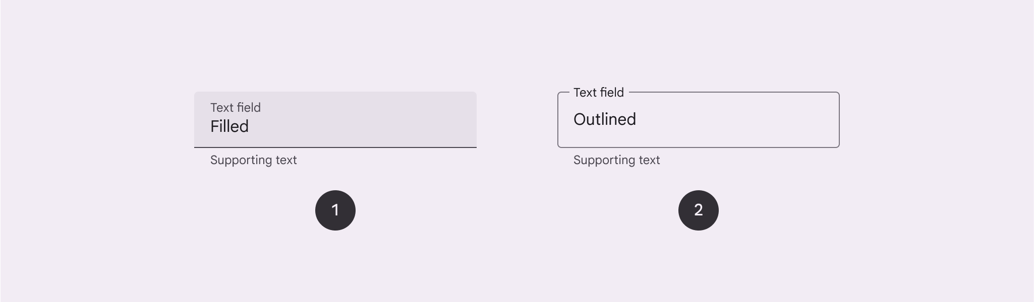
- Filled (填充型): 具有更强的视觉冲击力。
- Outlined (轮廓型): 视觉显著性较低,适用于表单密集的场景。
核心属性
1. 填充型 (Filled)
| 元素 | 属性 | 默认值 |
|---|---|---|
| 容器颜色 | app:boxBackgroundColor | ?attr/colorSurfaceContainerHighest |
| 指示器颜色 | app:boxStrokeColor | ?attr/colorOutline |
2. 轮廓型 (Outlined)
| 元素 | 属性 | 默认值 |
|---|---|---|
| 边框颜色 | app:boxStrokeColor | ?attr/colorOutline |
| 边框宽度 | app:boxStrokeWidth | 1dp |
代码实现
基础用法
xml
<com.google.android.material.textfield.TextInputLayout
    style="?attr/textInputFilledStyle"
    android:layout_width="match_parent"
    android:layout_height="wrap_content"
    android:hint="请输入用户名">

    <com.google.android.material.textfield.TextInputEditText
        android:layout_width="match_parent"
        android:layout_height="wrap_content" />

</com.google.android.material.textfield.TextInputLayout>
xml
<com.google.android.material.textfield.TextInputLayout
    style="?attr/textInputOutlinedStyle"
    android:layout_width="match_parent"
    android:layout_height="wrap_content"
    android:hint="请输入密码">

    <com.google.android.material.textfield.TextInputEditText
        android:layout_width="match_parent"
        android:layout_height="wrap_content"
        android:inputType="textPassword" />

</com.google.android.material.textfield.TextInputLayout>
增强功能
1. 尾部图标模式 (End Icon Modes)
常用模式
password_toggle: 密码可见性切换。clear_text: 一键清除文本。custom: 使用自定义图标。
xml
<com.google.android.material.textfield.TextInputLayout
    app:endIconMode="password_toggle">
    ...
</com.google.android.material.textfield.TextInputLayout>
2. 下拉菜单 (Exposed Dropdown Menu)
替代传统的 Spinner。
xml
<com.google.android.material.textfield.TextInputLayout
    style="@style/Widget.Material3.TextInputLayout.OutlinedBox.ExposedDropdownMenu">

    <AutoCompleteTextView
        android:layout_width="match_parent"
        android:layout_height="wrap_content"
        android:inputType="none"
        app:simpleItems="@array/options" />

</com.google.android.material.textfield.TextInputLayout>
错误处理与计数器
xml
<com.google.android.material.textfield.TextInputLayout
    app:errorEnabled="true"
    app:counterEnabled="true"
    app:counterMaxLength="20">
    ...
</com.google.android.material.textfield.TextInputLayout>
kotlin
// 代码中设置错误
textInputLayout.error = "格式不正确"