列表 (Lists)
源:Lists
列表是连续的、垂直排列的文本或图像索引。

列表项尺寸
列表项根据内容行数分为三种尺寸:
- 单行 (One-line): 仅包含一行主要文本。
- 双行 (Two-line): 包含主要文本和一行辅助文本。
- 三行 (Three-line): 包含主要文本和最多两行辅助文本。
核心结构 (Anatomy)
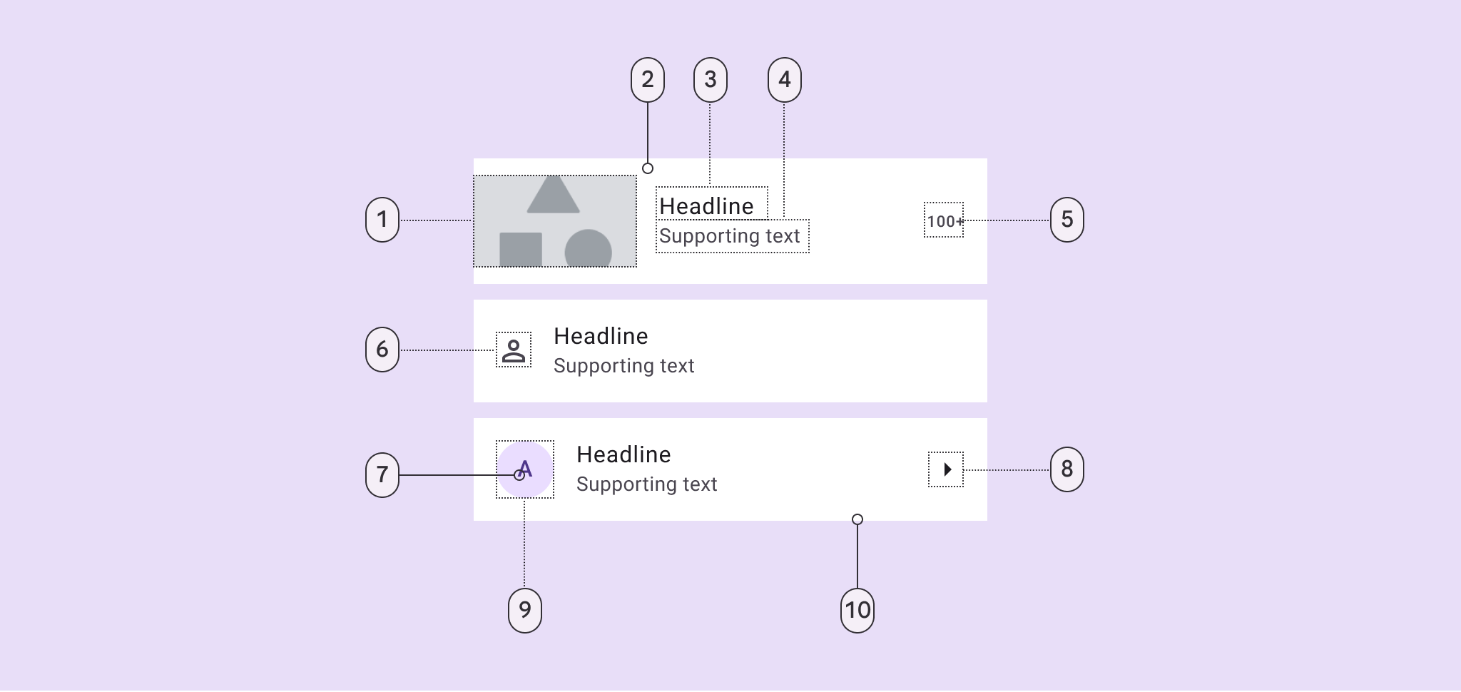
- 头像/缩略图 | 2. 容器 | 3. 主标题 | 4. 辅助文本 | 5. 尾部说明 | 6. 前置图标 | 8. 尾部图标 | 10. 分割线
代码实现
推荐结合 RecyclerView 使用。M3 提供了 ListItemLayout 和 ListItemCardView 来简化实现。
1. 基础用法 (XML)
xml
<com.google.android.material.listitem.ListItemLayout
    android:layout_width="match_parent"
    android:layout_height="wrap_content">

    <com.google.android.material.listitem.ListItemCardView
        android:layout_width="match_parent"
        android:layout_height="wrap_content"
        android:checkable="true">

        <LinearLayout ...>
            <ImageView android:id="@+id/leading_icon" ... />
            <TextView android:id="@+id/headline" ... />
        </LinearLayout>

    </com.google.android.material.listitem.ListItemCardView>
</com.google.android.material.listitem.ListItemLayout>
2. 侧滑显示操作 (Swipe-to-reveal)
M3 列表支持侧滑拉出操作按钮。
组件配合
使用 ListItemCardView 作为可滑动主体,配合 ListItemRevealLayout 作为背景操作层。
xml
<com.google.android.material.listitem.ListItemLayout ...>
    <!-- 前景:可滑动内容 -->
    <com.google.android.material.listitem.ListItemCardView
        android:id="@+id/swipe_card"
        app:swipeToPrimaryActionEnabled="true" ...>
        ...
    </com.google.android.material.listitem.ListItemCardView>

    <!-- 背景:侧滑后显示的操作 -->
    <com.google.android.material.listitem.ListItemRevealLayout ...>
        <Button android:text="删除" ... />
    </com.google.android.material.listitem.ListItemRevealLayout>
</com.google.android.material.listitem.ListItemLayout>
交互监听
kotlin
listItemCardView.addOnSwipeStateChangedCallback { newState ->
    if (newState == STATE_SWIPE_PRIMARY_ACTION) {
        // 执行首要操作(如删除)
    }
}
辅助功能
对于列表中的纯装饰性元素(如头像占位图),应通过以下属性让 TalkBack 跳过:
xml
android:focusable="false"
android:importantForAccessibility="no"