拆分按钮 (Split Button)
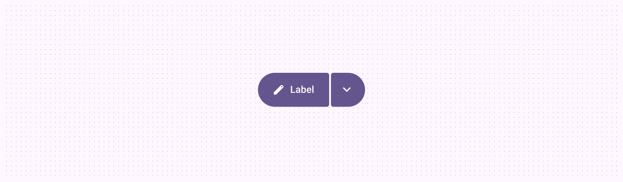
拆分按钮允许用户执行主要操作,或打开菜单以查看更多相关的次要选项。它是连结按钮组的一种特殊变体。
核心结构 (Anatomy)
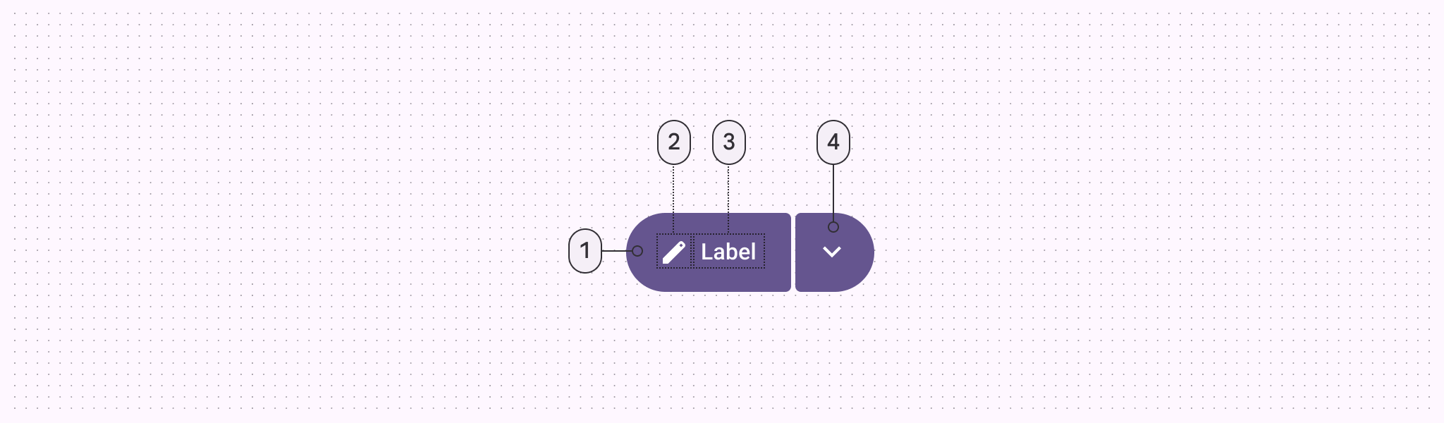
- 主要按钮 | 2. 图标 | 3. 标签文本 | 4. 尾部菜单按钮
代码实现
拆分按钮由一个主要按钮和一个尾部可点击的菜单按钮组成。
xml
<com.google.android.material.button.MaterialSplitButton
    android:id="@+id/splitButton"
    android:layout_width="wrap_content"
    android:layout_height="wrap_content">

    <!-- 左侧主要操作 -->
    <Button
        style="?attr/materialSplitButtonLeadingFilledStyle"
        android:layout_width="wrap_content"
        android:layout_height="wrap_content"
        android:text="发送邮件"
        app:icon="@drawable/ic_send" />

    <!-- 右侧下拉箭头 -->
    <Button
        style="?attr/materialSplitButtonIconFilledStyle"
        android:layout_width="wrap_content"
        android:layout_height="wrap_content"
        app:icon="@drawable/m3_split_button_chevron_avd" />

</com.google.android.material.button.MaterialSplitButton>
交互与动画
动画反馈
拆分按钮的尾部按钮通常关联一个 AnimatedVectorDrawable (AVD),当点击展开菜单时,箭头会产生旋转动画。
主题化
拆分按钮支持所有标准的 M3 按钮样式:填充 (Filled)、色调 (Tonal)、轮廓 (Outlined) 和 悬浮 (Elevated)。
| 元素 | 样式属性 |
|---|---|
| 主要按钮 (Filled) | ?attr/materialSplitButtonLeadingFilledStyle |
| 菜单按钮 (Filled) | ?attr/materialSplitButtonIconFilledStyle |