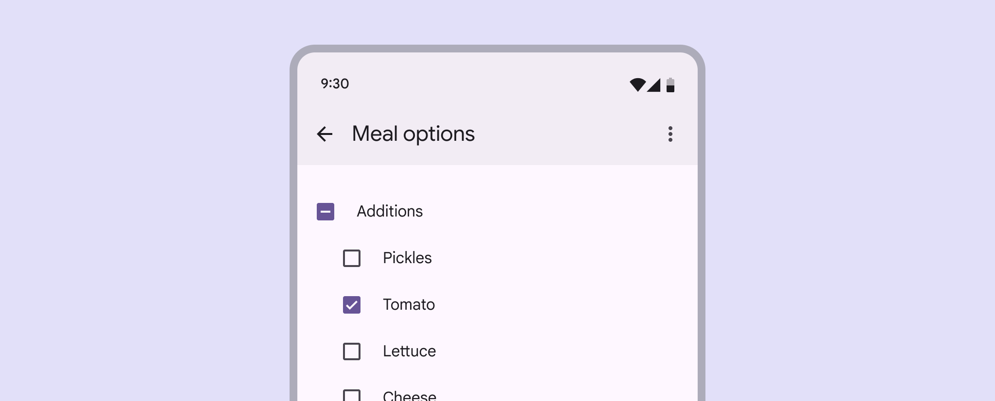
复选框 (Checkbox)
源:Checkbox
复选框允许用户从列表中选择一个或多个项目,或者打开/关闭某个设置。
核心属性
| 属性 | 描述 | 默认值 |
|---|---|---|
app:buttonTint | 复选框框体的着色 | ?attr/colorOnSurface |
app:buttonIconTint | 内部勾选图标的着色 | ?attr/colorOnPrimary |
app:checkedState | 状态:checked, unchecked, indeterminate | unchecked |
状态与交互
M3 复选框支持三种状态:
- 已选中 (Checked)
- 未选中 (Unchecked)
- 不确定 (Indeterminate): 通常用于父复选框,表示子项部分被选中。
代码实现
xml
<CheckBox
    android:id="@+id/checkbox"
    android:layout_width="wrap_content"
    android:layout_height="wrap_content"
    android:text="我同意用户协议" />
kotlin
checkbox.setOnCheckedChangeListener { buttonView, isChecked ->
    // 响应选中/取消选中
}

// 设置不确定状态 (M3 独有)
checkbox.checkedState = MaterialCheckBox.STATE_INDETERMINATE
辅助功能
复选框支持错误状态显示:
kotlin
checkbox.errorShown = true
checkbox.errorAccessibilityLabel = "错误:必须勾选此项"
主题化
xml
<style name="Widget.App.CheckBox" parent="Widget.Material3.CompoundButton.CheckBox">
    <item name="buttonTint">@color/my_checkbox_selector</item>
</style>